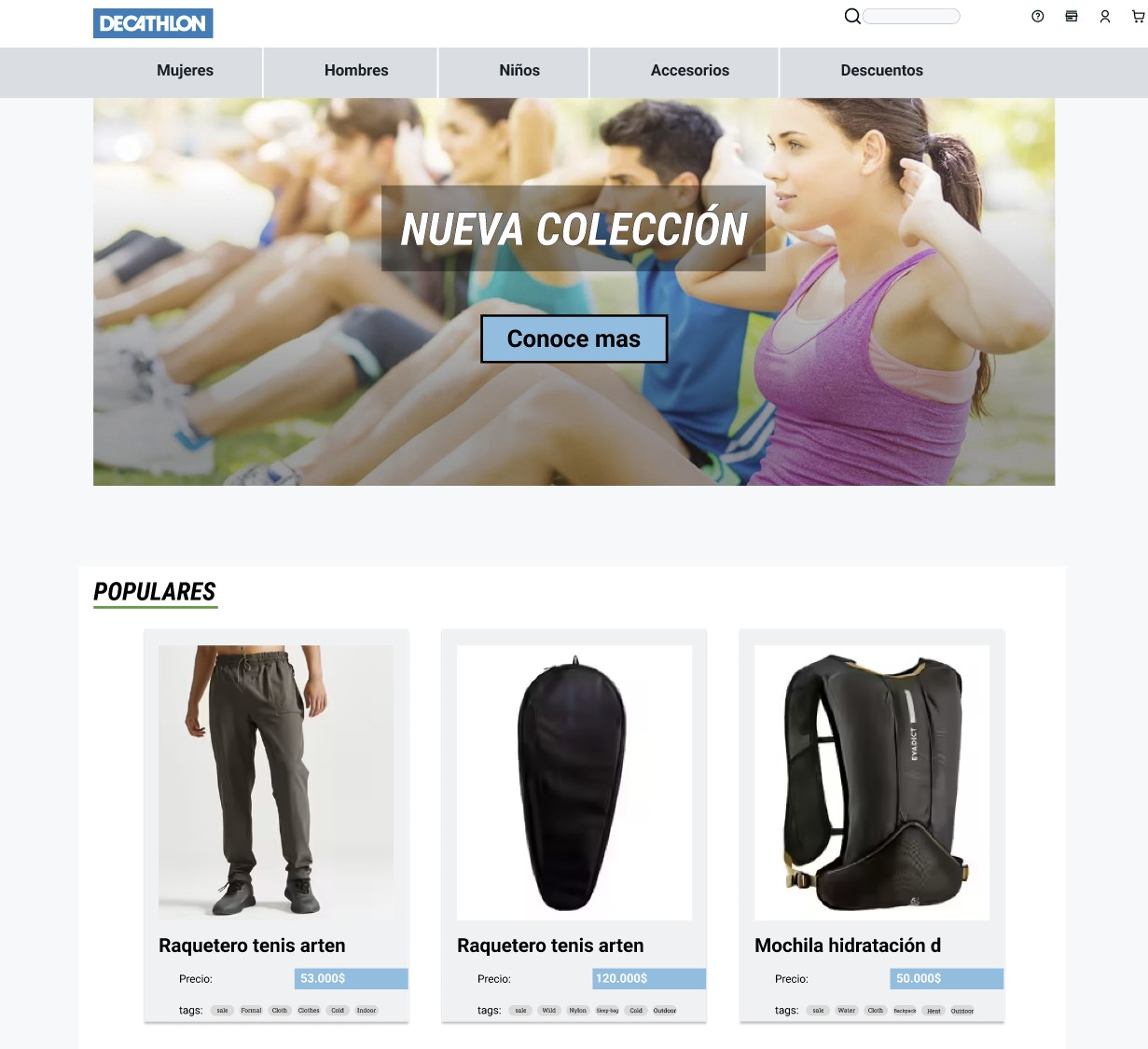
Decathlon's Colombian e-commerce site had problems visible to anyone who used it: outdated visual language, non-functional buttons, and a checkout flow unsatisfying for everyone involved. The brief the teacher gave was to identify the real failure points, not through assumption, but through research, and propose targeted improvements that would actually fix them.
What users actually said
The interviews surfaced three consistent themes. First, visual distrust: the site's outdated aesthetic made people hesitate before entering payment information. Second, navigation confusion: carousels that didn't respond to touch, categories that weren't where users expected them. Third, an incomplete checkout, no product suggestions, no confidence that the cart had captured what they wanted.
None of these were exotic findings. But they were specific, and specificity is one of the principal things that makes a redesign proposal, rather than cosmetic, defensible.
"Users didn't distrust the brand. They distrusted the interface and that's a design problem with a design solution."
Two changes, one argument
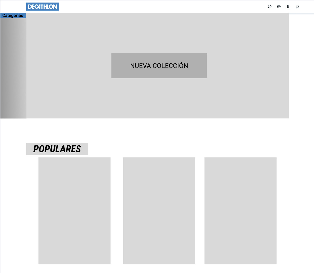
The proposal focused on two targeted interventions rather than a full visual overhaul. The first was the carousel system: rebuilt as a responsive, touch-native component with clear navigation affordances. The original version had functional failures, such as buttons that appeared but didn't respond, which the new system eliminated entirely.
The second was the cart experience: adding a product suggestion layer at the point of checkout. The implementation proposal was deliberately minimal: related products were shown contextually, making sure it wasn't perceived as promotional noise.
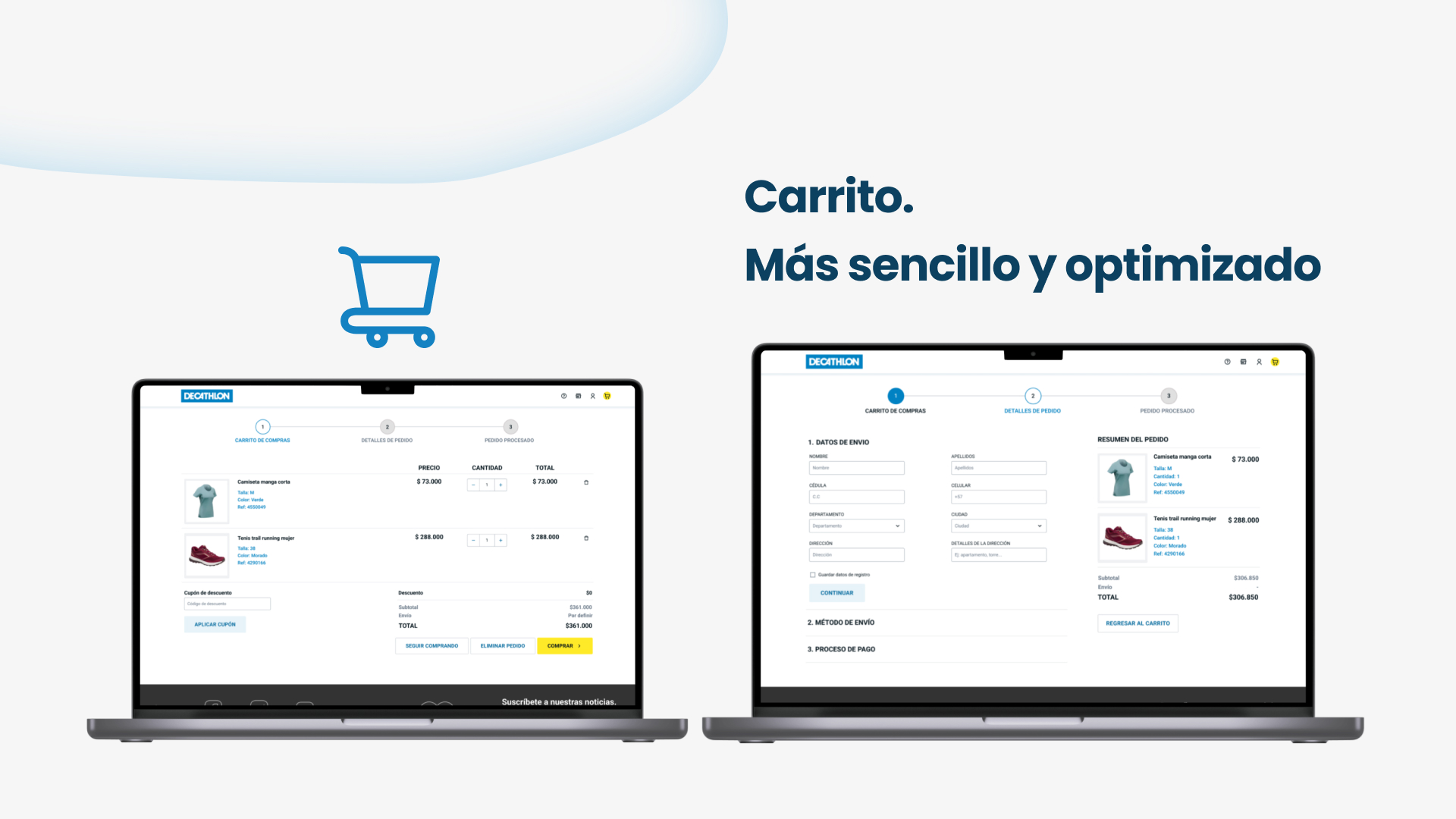
The redesign proposal was completed as a university case study in Figma. Starting from research produced a solid proposal that was easier to justify.